Event Website | DemoDays
A conceptual website for finding mountain bike and ski demos.
-
Background
DemoDays began as a conceptual project during my UX Design course with General Assembly. I’ve since revisited DemoDays during an advanced design course with Matthew Reiswig.
-
Iterations
The first iteration of DemoDays was a mobile application. After listening to some feedback from prospective users, I designed a demo website for the second iteration.
-
Future Work
I’m currently exploring the possibility of making Demo Days a reality, by meeting with a developer and presenting to friends in the industry.
Problem
During initial interviews, we heard from riders that some hang-ups they’re currently running into are that:
Searching for bike demos is time consuming
Demos are typically specific to a brand or location
There isn’t one place to search for demos across all brands and locations
Demos pass without any knowledge
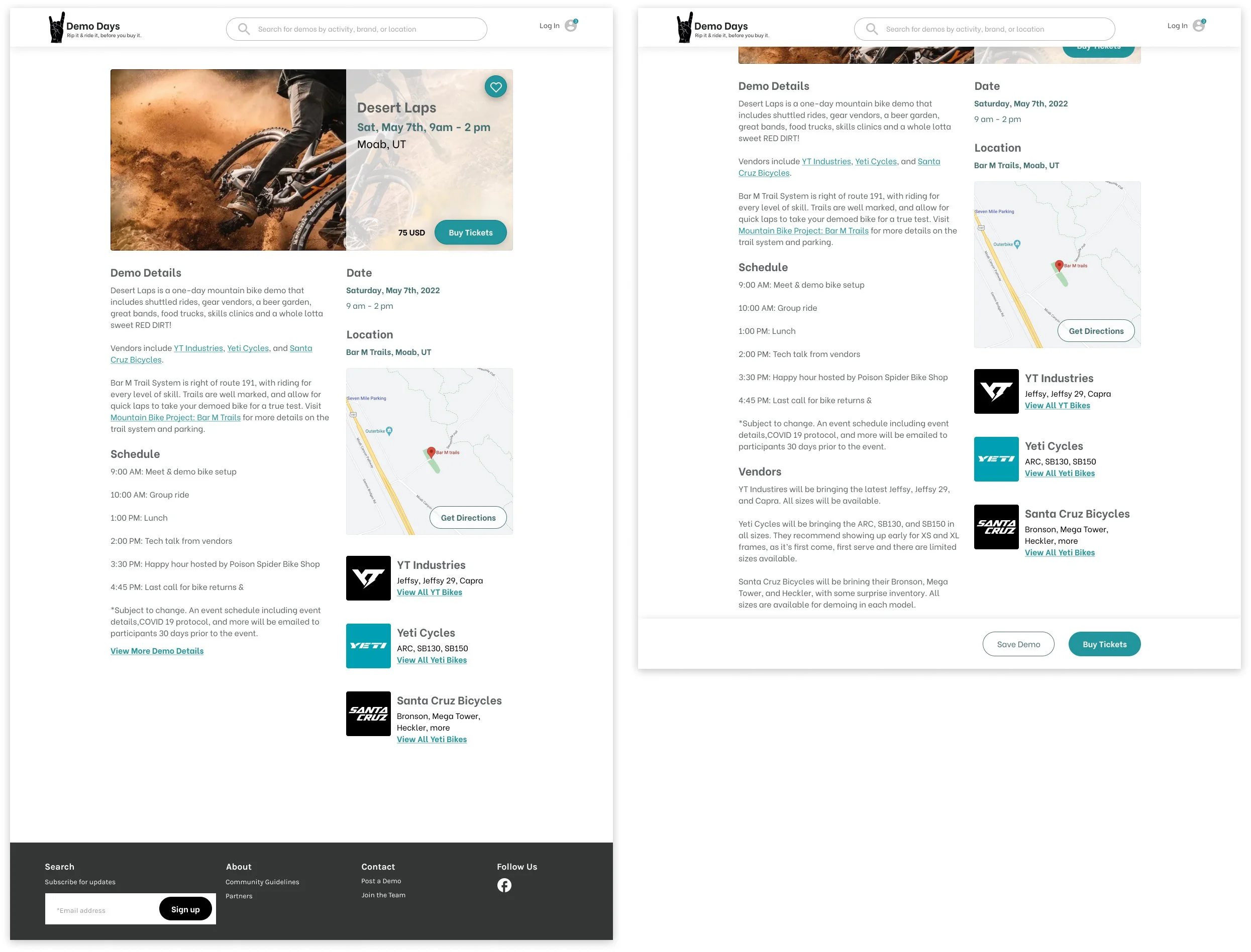
MLP
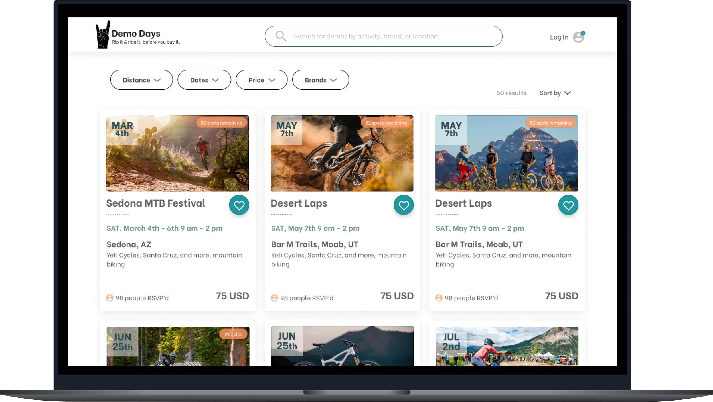
Searchable demo list
Filters for distance and brands
Save demos and purchase admission
Receive demo updates through a newsletter
Target User
Our target user is someone who likes experienced-based shopping. They prefer to be outside of the shop, and on the dirt. They replace their bike regularly, every couple of seasons, and they’re investing anywhere between 3-5k. They want to have confidence they’re making the right purchase based on the trails they ride and their riding style AND, they want to have fun in the process.

Competitive Analysis
While vendors are posting their own demos on their site, and that organization might post their event on site like Eventbrite, there isn’t currently a site specifically for bike demos where users can search across all different venues and brands.

Psychological Principles

Filters & Sort
Because filters were such an important aspect of the site, we looked at a few different options, including a more complex filter system on the left. We knew from a past card sort the order of importance users placed for each filter item, which informed the hierarchy for this complex filter.

The complex sort included specific locations, but ultimately we went with a simplified filter system which consisted of filter buttons with a dropdown menu across the top of the page, below the general search. We also replaced the specific filter for locations with a distance filter, allowing users to choose a radius by entering their zipcode and milage, and display that radius. This also addresses the concern for limited demos within a specific location and given timeframe.
Sticky CTA
Within the demo details, we’re displaying the most important information at the top, and we’re not limiting the depth for vendors and venues who are posting, but we are opting for a view more/viewless text button which does limit the complexity of details right away. Because we anticipate that some vendors and venues will want to include depth in the details, we did also design a sticky CTA for purchasing tickets or RSVPing which would remain in view, at the bottom of the users screen when they scroll past the CTAs in the header.